Question
Can a game measure how prepared someone is for a crisis better than a questionnaire can?
VRT Twente, the regional safety authority for Twente, assesses public preparedness the way most authorities do: with static questionnaires. The method has five known failures, and they had all of them. Engagement rates are low. Real decision-making skill cannot be measured by asking someone to describe it. There is no interactive learning in a form. Safety information given this way is poorly retained. And the respondent gets almost no feedback on how they actually did.
Every one of those is a symptom of the same thing: a questionnaire measures what a person believes about themselves under no pressure whatsoever.
Constraint
Four months, four people, one scenario, and a public that would not install anything.
The work ran October 2021 to January 2022. The team was four: two specialising in programming, two from industrial design. Whatever we built had to be deployable by a regional authority to the general public, which ruled out installs, accounts and a facilitator in the room — it had to open in a browser and hold a stranger's attention with no reward loop behind it.
We scoped to a single crisis: a power outage. One scenario done properly beats five done thinly when the thing being measured is decision quality.
What I owned
Three things, across the whole arc: devising the plan for the initial user research, planning the prototype flow from what that research returned, and building the web application itself. The research-to-build span is the reason the findings survived into the product — nothing was lost in a handoff, because there wasn't one.
Decision
Six calls, and the two most useful ones were both refusals.
Decision 01
Study the serious games that already exist before designing one
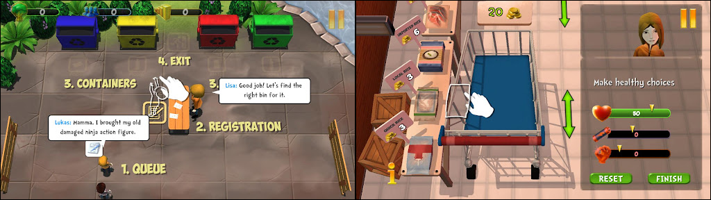
We surveyed serious games on the market and took apart the methods they used, rather than starting from a blank page. World Rescue was the primary reference — a published serious game solving an adjacent problem well enough to learn its structure from.
What came out of that survey was the shape of our own solution: branching narratives over realistic scenarios, immediate feedback with the correct procedure explained, and assessment analytics running underneath the whole thing rather than a score at the end.
Rejected: designing from first principles. In a four-month project with two designers who had not built a game before, originality was the expensive option and the least useful one.
Decision 02
Let users write the game's action list, via card sorting
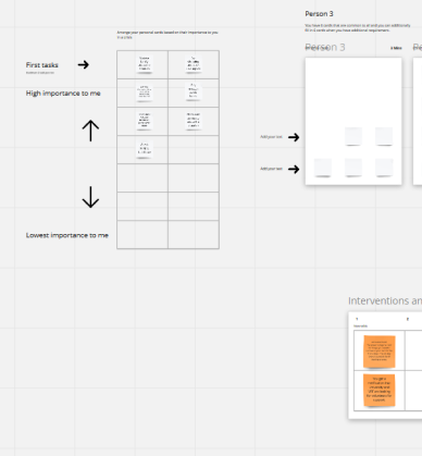
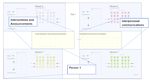
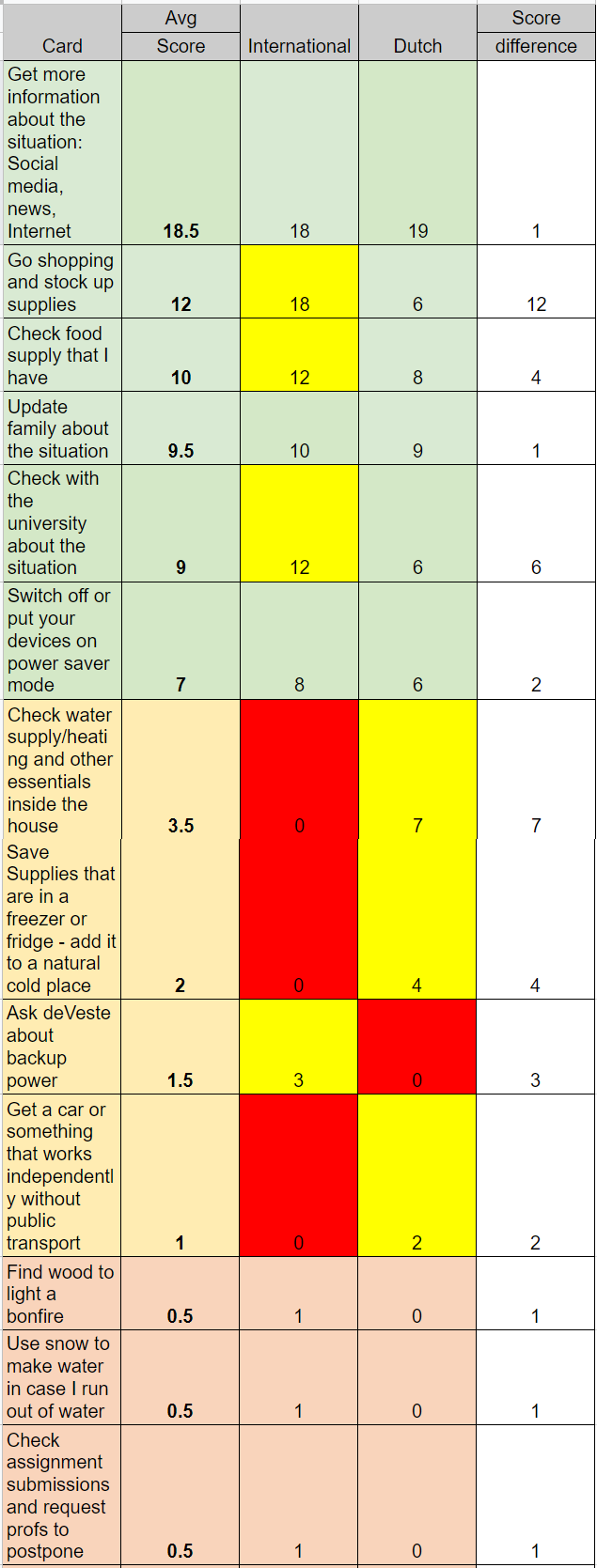
The game is only a measurement instrument if the actions it offers are the actions people would really consider. So we ran a card sorting activity in MIRO: candidate crisis actions on cards, ranked by importance, with participants free to add their own cards. Alongside it we ran interventions with varied scenarios to watch what actions people reached for under different framings.
We went in with a hypothesis: that international residents and Dutch residents would have different plans of action. It held. The output was a genuinely diverse list of choices to build into the game — one that neither pair of us would have written alone.
Traded away: a tighter, more designable action set. A list assembled from two populations is harder to balance than one we invented.
Decision 03
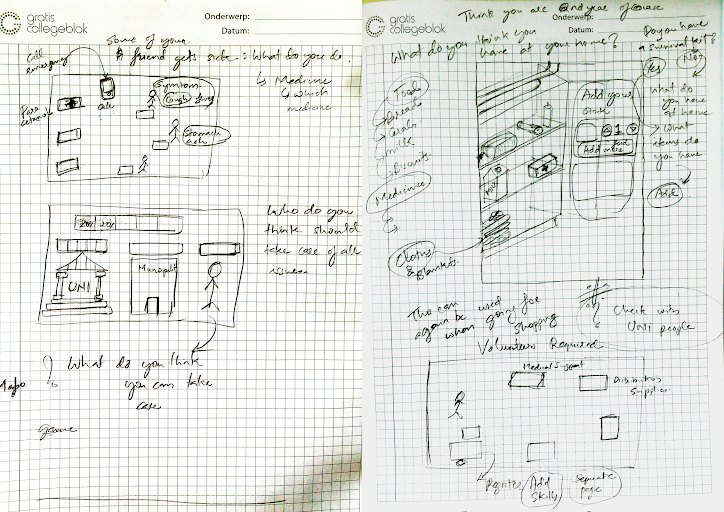
No paper prototypes
Standard process says sketch, then paper prototype, then digital. We sketched — the game's look and the UX cycle it moves through were both settled in that phase — and then skipped paper entirely.
The reason is specific to what we were making. This game's instrument is pressure: it measures decisions taken while a crisis feels real. A paper prototype cannot convey the severity of a crisis without visual cues and graphics, so testing on paper would have measured how people behave when nothing is at stake — which is the exact failure mode of the questionnaire we were replacing.
Rejected: the orthodox fidelity ladder. Testing a severity-dependent artefact at a fidelity that cannot express severity produces clean data about the wrong thing.
Decision 04
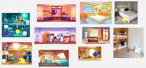
Illustration-style 2D, built from the card sort
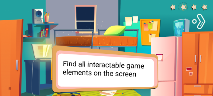
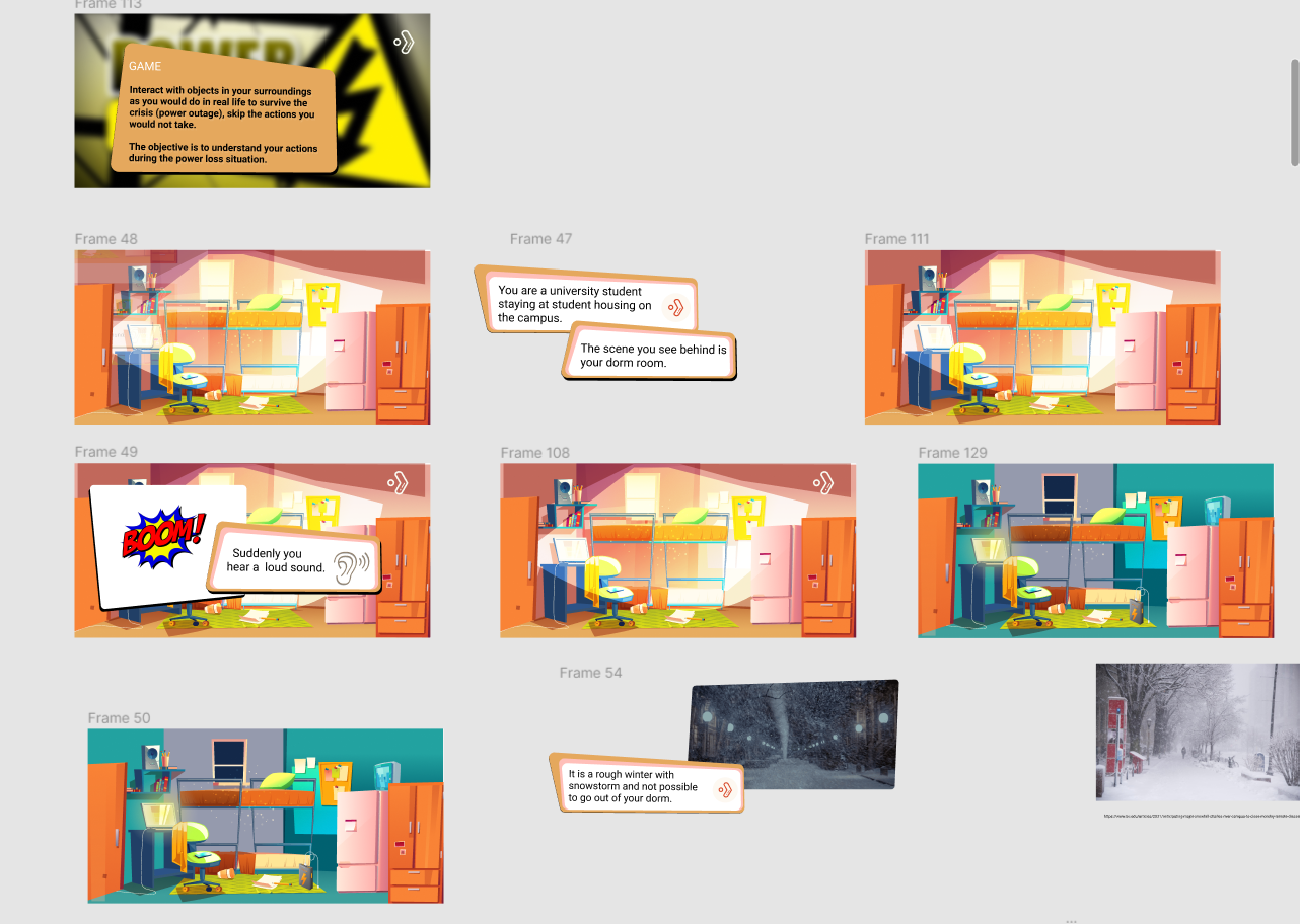
We chose an illustrated 2D style, and derived the game screens directly from the card-sorting activities rather than inventing a new interaction language for them — refined, but structurally the same thing participants had already handled.
This decision has a cost we measured later, and it is in the results below.
Decision 05
Settle the information structure in one long room
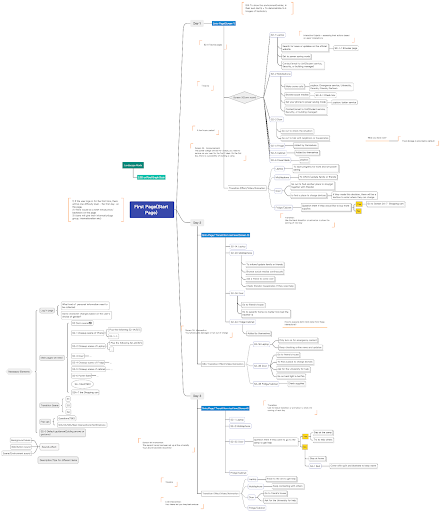
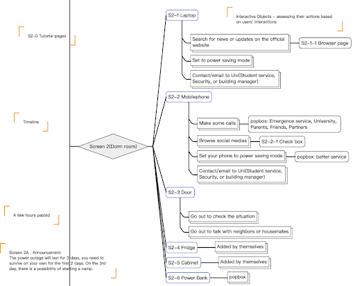
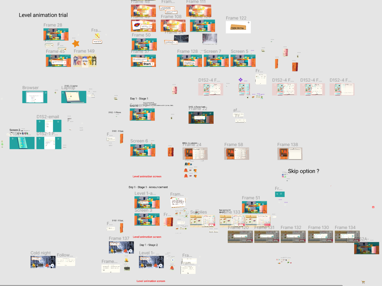
Rather than iterate the structure asynchronously, we defined the game in a single long in-person meeting: what the user does on each day of the scenario, the mode of interaction, and the user flow through the whole thing. Branching narratives get expensive to restructure once built, so the structure was worth stopping for.
Decision 06
Two rounds of high-fidelity testing instead of one lo-fi and one hi-fi
Partly principle — the same severity argument as Decision 03 — and partly a time crunch we had by then earned honestly. We ran two phases of HiFi testing instead.
Traded away: cheap early failure. Every structural mistake we made had to be found at a fidelity that was expensive to change, and the "half-baked functions" in the limitations below are the bill for it.
What shipped
The final game was programmed with vanilla JavaScript against the Figma design — no engine, no framework, so it loads instantly on whatever a member of the public brings. It is fully responsive across desktop, tablet and mobile, and it was published at a playable link.
Four features carry the assessment. Realistic scenarios spanning natural disasters, accidents and emergencies, with storylines that branch on user decisions. Performance analytics tracking decision-making patterns, response times and knowledge retention. Immediate feedback that explains the correct procedure at the moment of the choice rather than in a debrief. And a responsive build, because a safety region cannot ask the public what device to use.
Outcome
- 75.63SUS score, SD 13.01
- 2.0+UEQ perspicuity — excellent
- 85%Satisfaction, gamified experience
- 90%Positive on intuitive design
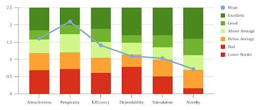
The UEQ, attribute by attribute
The per-attribute breakdown is more useful than the headline, because it names exactly where the illustrated-2D decision paid and where it cost.
| Attribute | Result | Reading |
|---|---|---|
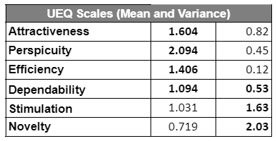
| Attractiveness | Mean > 1.5 | Our best result. Above the threshold considered acceptable for publishing |
| Perspicuity | Mean > 2.0, variance 0.45 | Excellent — and the most important attribute for a serious game |
| Efficiency | Above average | Creditable given how many answers the game collects from each participant |
| Dependability | Not measurable | Never a focus, and testers were told this was only a test |
| Stimulation | Worst, high variance | The most subjective attributes; expectations vary widely between users |
| Novelty | Worst, high variance | Same. High variance is itself the finding |
Perspicuity is the one that matters here. A serious game used as an assessment instrument is worthless if players misunderstand what is being asked — a mean above 2.0 with variance of 0.45 says they did not. The stimulation and novelty scores are the honest cost of Decision 04, and the high variance says as much about the spread of expectations people bring to "a game about a power cut" as about the game.
All of it was measured on a limited number of testers. We ran short of time before we ran short of willingness, and a larger sample is the first thing I would buy with another month.
What testers said worked
Four things came back consistently. The game was intuitive — nobody struggled to work out what to do on any screen. The colourful graphics, chosen to lighten the situation and make it feel like a game rather than an exam, were appreciated by almost everyone. The clarity of the information available in the game was likewise. And the one I did not expect: it was genuinely fun to answer questions in a click-and-play visual format — which, for an instrument replacing a questionnaire, is not a nice-to-have but the entire mechanism.
Whether VRT Twente ever ran it with the public, I do not know. So the instrument's usability is measured and its accuracy as an assessment is not — the one thing the project set out to beat a questionnaire at is the one thing it has no result for.
Limits
Four, and we published all of them.
Some functions were half-baked — we developed the game only to a certain extent within the constraints. The graphics, appreciated by most, reduced the intensity of the situation for some, which is a real hit on an instrument that depends on pressure. Storytelling thins out badly in the later parts of the game; we overlooked it as we went. And the game is rigid — no smooth transitions, no progress indicators, few gamification elements.
What I would do next
Gamification and storytelling first: they are the most severely lacking and they are what the stimulation and novelty scores were telling us. Then more scenarios, especially self-related ones — the majority view was that the game was too short. Then a real feedback system: let players revisit and change previous answers, grade every action that can be graded, and return something substantial rather than a thank-you screen.
A questionnaire measures what people believe about themselves. The game measured what they did — and scored 2.0 on being understood while doing it.
vanilla javascript · html5 · css3 · figma · miro · sus · ueq · branching narrative · 4-person team