Question
Can four people from four disciplines agree on what an app should be before anyone opens an editor?
Cashpool lets users create teams and pool money toward common financial goals. That sentence took months to earn. The thesis brief was to take a conceptual idea all the way to a functional Android application while validating both the experience and the interface — which meant the real subject was never the app. It was whether a research process can settle disagreements that a team of four could otherwise argue about indefinitely.
Constraint
Four people with no shared defaults, and a build window measured in weeks.
The team was four, drawn from programming and industrial design. That composition is a liability under deadline — nobody agrees on what "obvious" means — and an asset everywhere else, which is the tension the whole project turned on.
Note: the original write-up carried two durations — an overall eight months, and an intensive 90-day build from March to May. The 90 days is the span I can place precisely.
What I owned
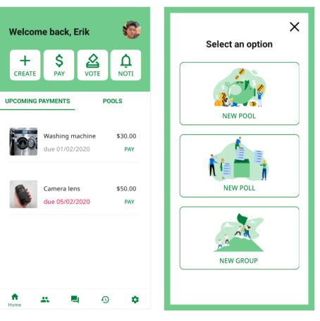
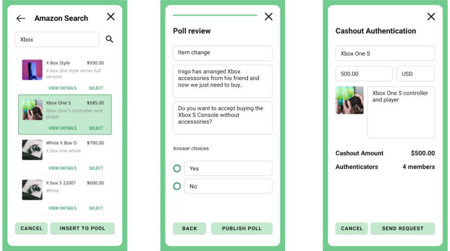
Three deliverables across the arc: the low-fidelity prototype models for both web and mobile, the user flow diagrams and information architecture derived from research insights, and the final Android application in Java. Research through to shipped code — the same span as every project I have liked working on since.
Decision
Five calls, and the process was designed to make the team stop guessing about each other.
Decision 01
Research two demographics, not one
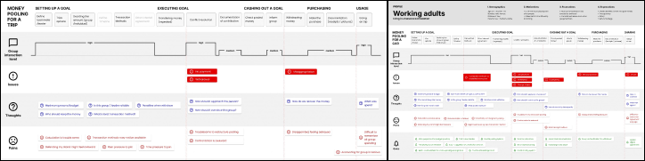
We ran a dual-approach strategy across two distinct segments — teenagers and adults — rather than picking a primary persona and optimising for it. Pooling money is a social act, and the social expectations of a nineteen-year-old and a forty-year-old around shared money are not the same thing with different styling.
The split paid immediately. Teenagers preferred purpose-driven, goal-oriented functionality — what are we saving for. Adults prioritised transparency and trust mechanisms above everything else — who can see what, and what stops this going wrong. That divergence set the feature prioritisation for the rest of the project.
Traded away: focus. Two segments means a wider feature surface and a harder prioritisation problem than one segment would have been.
Decision 02
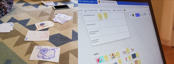
Card sorting in both physical and digital form
We combined traditional physical card exercises with digital collaboration in MIRO rather than choosing between them. Physical sorting reads better in the room — you see hesitation — and digital scales past the people you can get into a room. The purpose in both cases was the same: identify and prioritise the features that actually mattered instead of the ones we found interesting.
Decision 03
Simulate the behaviour before interviewing about it
We ran realistic cash-pooling simulations with participant groups first, then conducted 17 individual interviews into personal financial behaviour, then validated what came back through structured group card-sorting sessions with six participants each.
The ordering is the decision. People describe their financial behaviour inaccurately when asked cold; they describe it far better having just done it. Interviewing after the simulation meant we were asking about something the participant had a fresh, specific memory of rather than a self-image.
What the research returned
Four feature categories, each a distinct dimension of value:
| Category | What it covers |
|---|---|
| Core financial security | Monetary benefits, safety, trust, purpose, effectiveness |
| Operational transparency | Clear visibility into every transaction and team activity |
| User experience excellence | Freedom and efficiency of use |
| Community engagement | Engagement, fun, social influence |
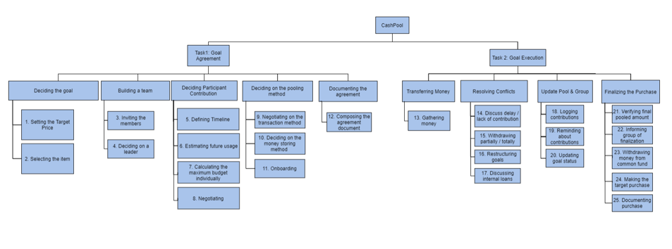
From there the work moved through user profiling into behavioural modelling and finished on journey mapping across the full lifecycle, plus a task organisation model for the app's internal structure.
Decision 04
Build mobile and web in parallel, not mobile first
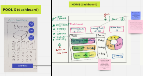
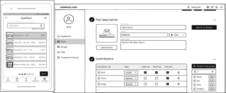
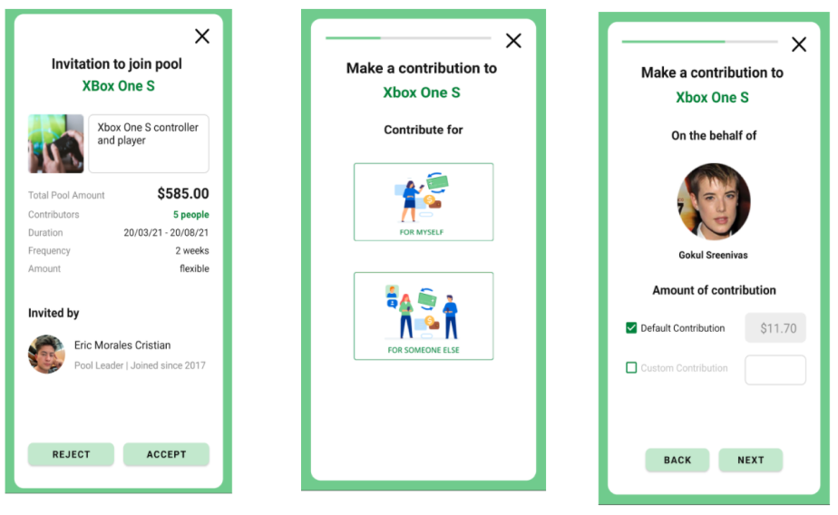
Sketching established the experience architecture and mapped the journey flow, and we developed parallel concepts for both platforms — exploring what each one made possible while holding the core experience principles constant.
Low-fidelity prototyping used Balsamiq-style hand-drawn elements inside Figma, which keeps a prototype visibly unfinished and stops reviewers commenting on corner radii when you need them looking at flows. Parallel lo-fi prototypes for both platforms let us validate the core flows and information architecture before committing to visual design.
Traded away: roughly double the prototyping effort, spent to keep the platform question genuinely open instead of assumed.
The paradox
The platform that measured better is not the platform people wanted.
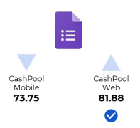
High-fidelity testing produced a result none of us had planned for. The web version demonstrated superior usability metrics. And users overwhelmingly preferred mobile anyway — driven by the convenience and accessibility of a phone, which is not a usability property at all.
We went with mobile. That is Decision 05, and it is the one worth remembering: platform choice drives adoption even when the usability numbers point the other way. A usability score measures the experience of someone already using the thing. It says nothing about whether they will open it in the first place, and an app nobody opens scores zero on every attribute that matters.
Rejected: following our own data to the web build. It was the defensible choice and it would have been the wrong one.
Outcome
- 84.38SUS score — excellent
- 9.30Standard deviation
- 17Individual interviews
- 90Days, March to May
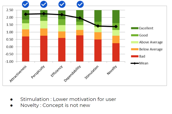
84.38 places the application firmly in the "Excellent" usability band. The standard deviation of 9.30 is the more interesting number: a tight spread across two deliberately different demographics means the design was not quietly optimised for one of them. The UEQ results agreed, and the high-fidelity round indicated the build met production-ready standards.
Five improvements, prioritised
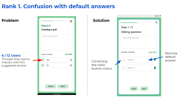
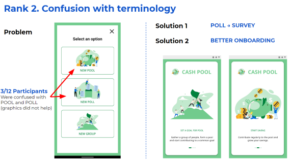
Testing surfaced five refinement opportunities, ranked by impact against implementation complexity rather than by how much they annoyed us.
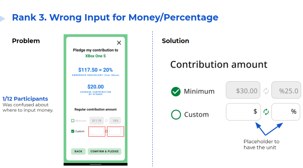
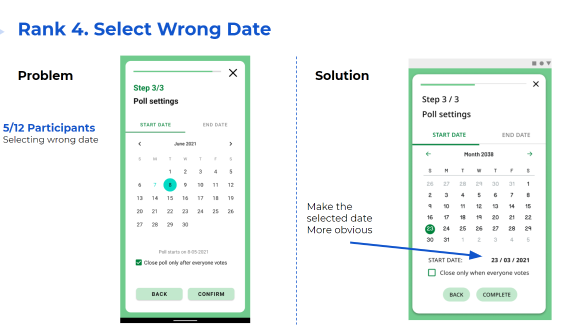
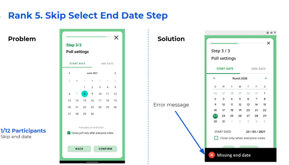
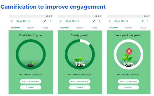
Separately, we developed gamification strategies aimed specifically at the stimulation and novelty weaknesses — engagement mechanics attached to a financial product without undermining the trust the adult segment had told us was non-negotiable.
The 17 interviews and the six-per-group validation sessions are recorded. The participant counts for the initial card sort and the usability tests are not, so those two findings carry less weight than the numbers beside them suggest.
What it taught me
Three things, and I have used all three since. Cross-disciplinary teams converge on solutions that no single domain would reach — the cost is that convergence has to be engineered, not hoped for, which is what the card sorts were really doing. User preference beats technical usability in adoption decisions, which is now the first thing I check when a metric and a behaviour disagree. And systematic research does more than validate assumptions: the segment split and the platform paradox were both things nobody on the team had predicted.
The card sort settled in an afternoon what four of us had been arguing about for a week. That is the whole argument for research.
android · java · android studio · figma · miro · card sorting · sus · ueq · journey mapping · 4-person team