Question
What do students actually feel during a lecture moving faster than they can write?
The mechanical problem is well known: students cannot listen, understand and write at the same time, and attempting all three costs them information and retention. Every note-taking tool on the market treats that as a capture problem and answers it with a faster way to capture.
We took the brief the other way round. ANT focused exclusively on the emotional journey of students during class — on the grounds that the reason a student loses the thread is rarely their typing speed.
Constraint
A prototype, four months, three people — and nowhere to hide.
This was never going to be built, which changes what the work has to be. There is no implementation to absorb a weak argument: everything had to be settled in the design and defended in research. The narrow brief helped — study the emotional experience of the lecture, not the feature list of a note-taking app — because it made "what would a competitor ship" an inadmissible answer.
The five failures we were designing against
Difficulty multitasking during a lecture. Missing important information while writing. Poor synchronisation between what is on the slide and what is in the notes. No emotional engagement in the learning. And stress and anxiety in lectures that outrun the student.
Only the third of those is a software problem in the ordinary sense.
Decision
Four calls. The first one determined the other three.
Decision 01
Map the emotions, then design against the map
Research produced five emotional states students move through during a lecture, and we treated them as the requirements document. Each one got a design response aimed directly at it — the entire interface derives from this table, and nothing in it was chosen because a note-taking app usually has one.
| State | What it is | Design response |
|---|---|---|
| Anxiety | Fear of missing important information | Intuitive interface, to reduce it |
| Frustration | Difficulty keeping up with a lecture outrunning you | Bright colours, to uplift mood and reduce stress |
| Overwhelm | Processing several information streams at once | Clear visual hierarchy, to cut cognitive load |
| Relief | Successfully capturing the key points | Positive feedback, to encourage engagement |
| Confidence | Feeling prepared and organised | Progress indicators, to build it |
Traded away: feature competitiveness. Nothing here was chosen to match what other note-taking tools offer, so the prototype loses any feature-by-feature comparison against them.
Decision 02
Include professionals in the research, not only students
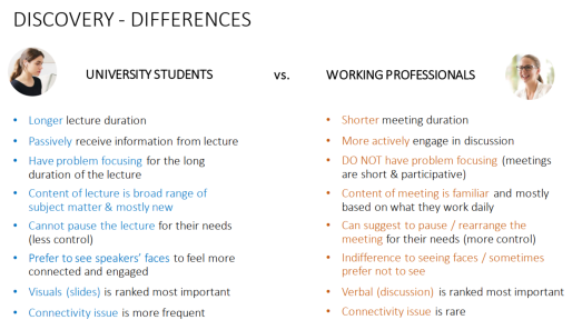
Stage one ran focus groups with both students and professionals. The student is the user, but the failure mode — trying to absorb, evaluate and record simultaneously while someone else controls the pace — belongs to anyone who sits in meetings. Including professionals tested whether the emotional pattern was a property of being a student or a property of the situation.
Findings from both groups were synthesised and mapped visually to steer the direction.
Decision 03
Establish the visual tone before the screens
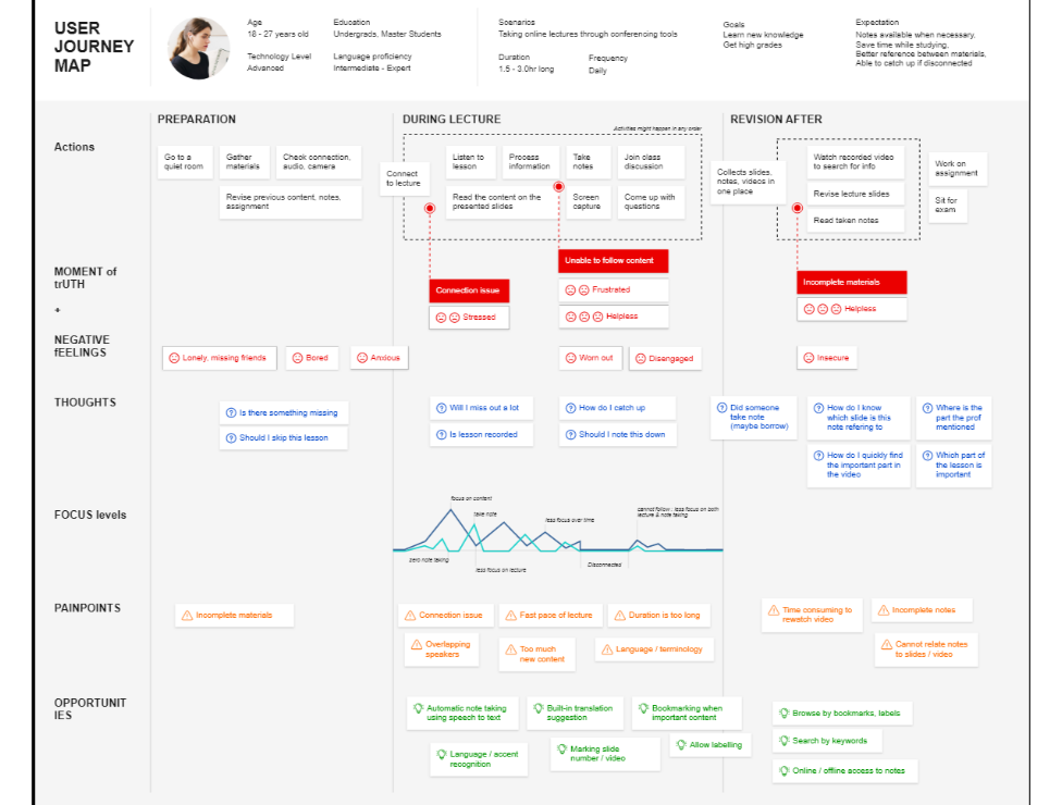
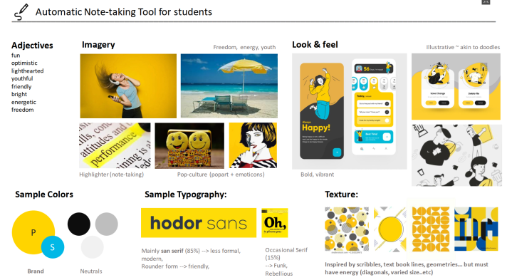
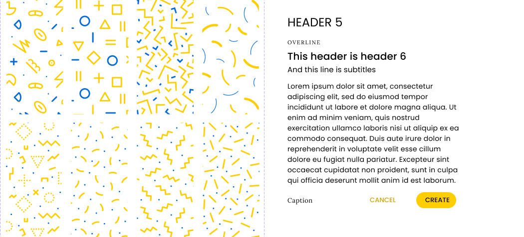
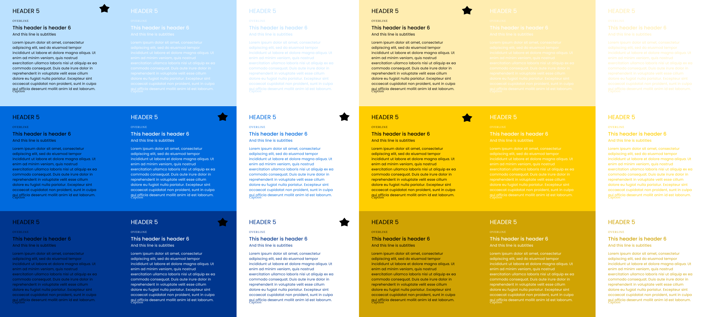
Stage two mapped the end-to-end student journey and produced a mood board defining the tone as bright, energetic and student-friendly. Doing this before layout meant the "bright colours" response from Decision 01 arrived as a specification rather than a preference someone could argue with later.
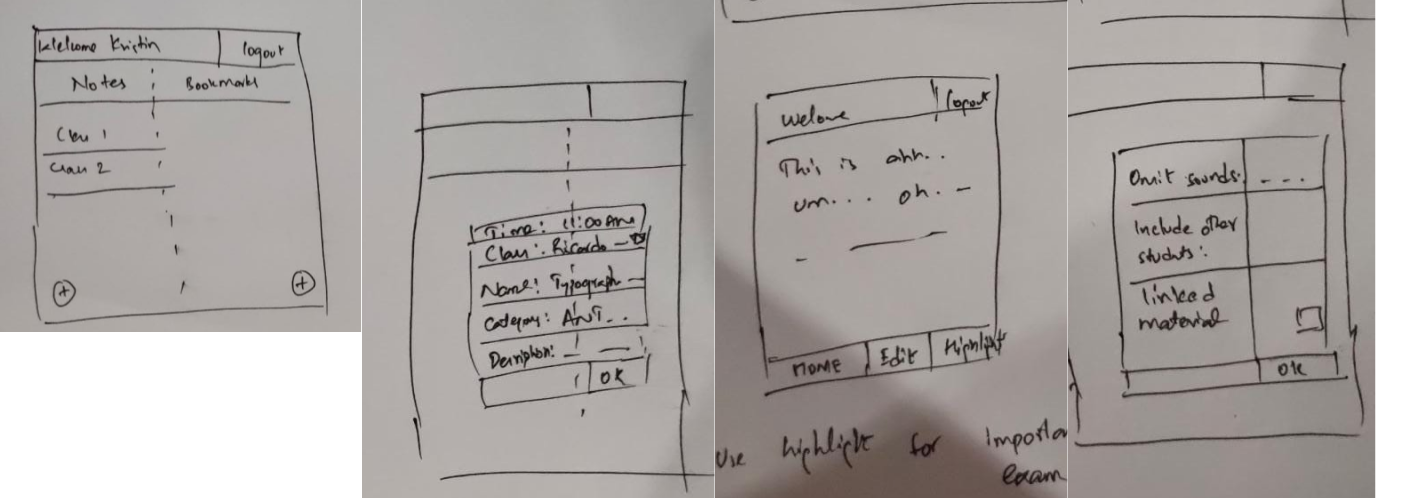
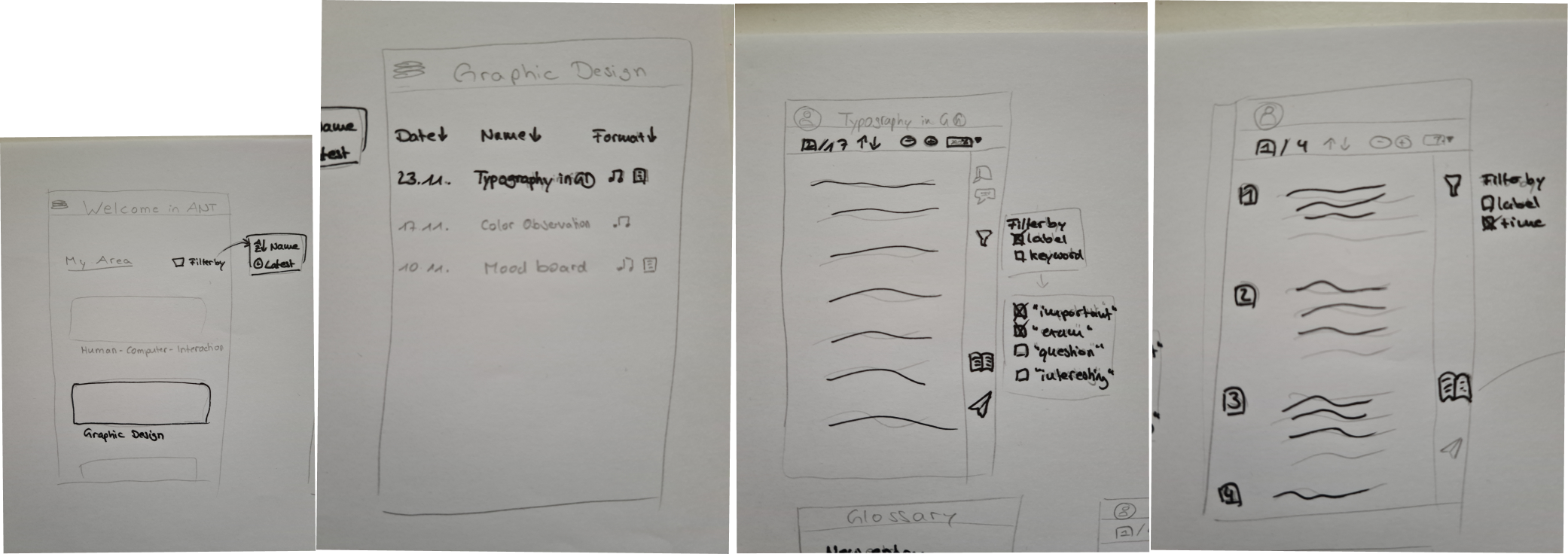
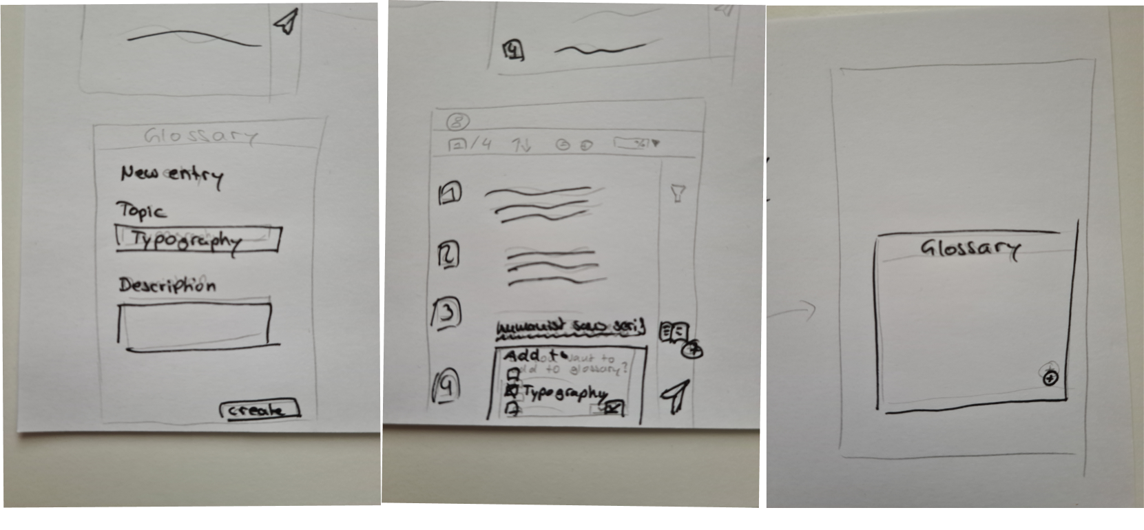
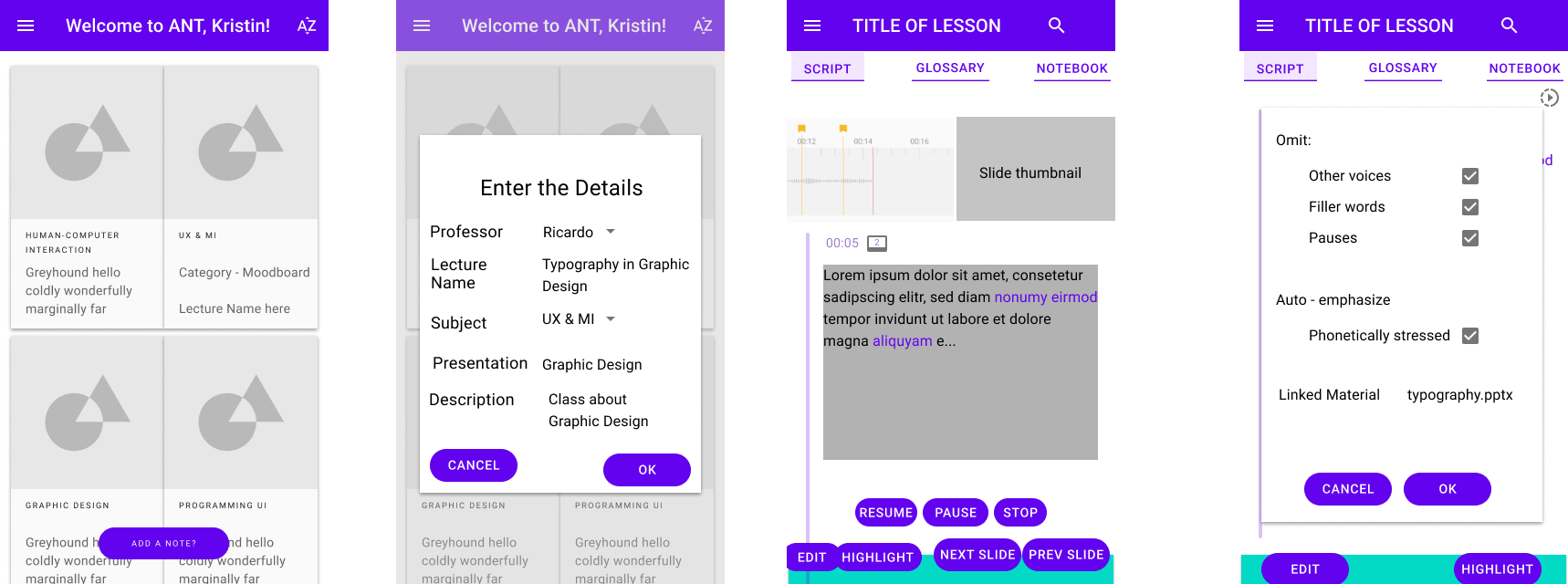
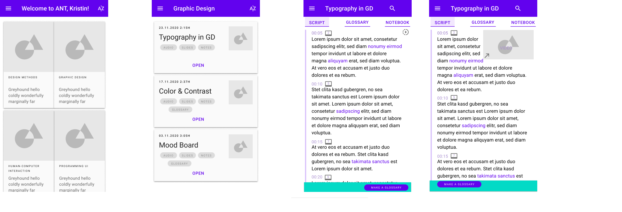
Stage three was rapid pen-and-paper sketching and low-fidelity wireframes, iterating layout, navigation and core interactions before anything went digital. Stage four turned the mood board into a design system for consistency, accessibility and scale — an unusual investment on a prototype, and the reason the hi-fi came together quickly.
10 process figures inside See how the design took shape Journey map · mood board · sketches · wireframes · design system · Fig. 02–11 Show all 10 process figures ↓ Hide the process figures ↑

Decision 04
Make missing a moment recoverable rather than making capture faster
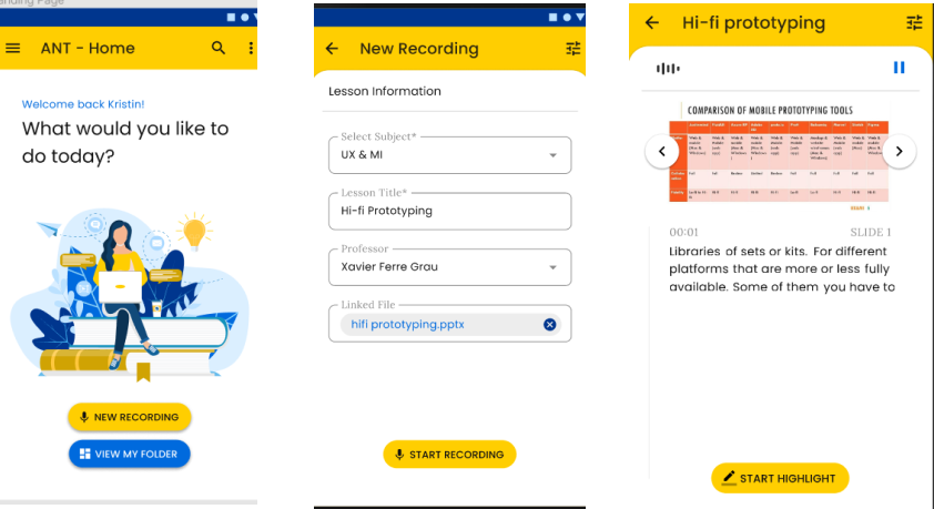
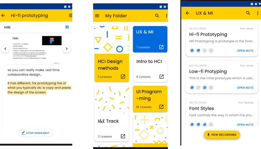
Four features carry the product, and they follow from the anxiety state rather than from a feature roadmap.
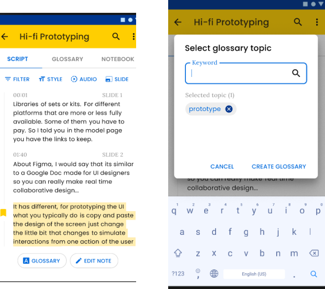
Voice synchronisation: real-time voice-to-text transcription that auto-syncs with the slides, removing manual note-taking rather than accelerating it. Slide integration: automatic detection and integration of the presentation slides, so the visual context and the notes stay bound together. Emotional design: the bright scheme and positive visual feedback, carried through from the map. Smart search: search across every synchronised note and slide, which is what makes the recovery real — a moment you missed is findable later instead of gone.
The anxiety in that lecture theatre is fear of a permanent loss. Remove the permanence and the fear goes with it. That is a different product from a faster keyboard.
Outcome
- 80%Improved emotional satisfaction
- 70%Reduction in note-taking stress
- 65%Increase in focus and attention
- 85%Positive on the bright design
Read those four together and they say the emotional thesis held: the largest movements are on satisfaction and stress, which is what the design was aimed at, with focus following rather than leading.
The method behind those four percentages is not recorded. The original write-up gives the numbers without the sample size or how the measurement was taken, and I will not reconstruct either from memory. It is the weakest point in a project whose whole claim is that it measured emotion properly.
What the UEQ found wrong
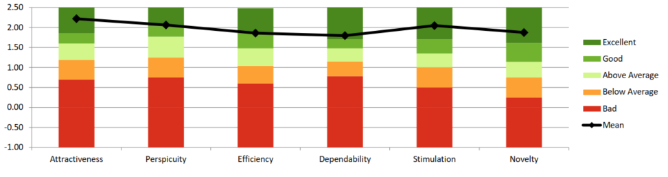
A User Experience Questionnaire was run alongside, and it returned five specific problems. We published them rather than the summary.
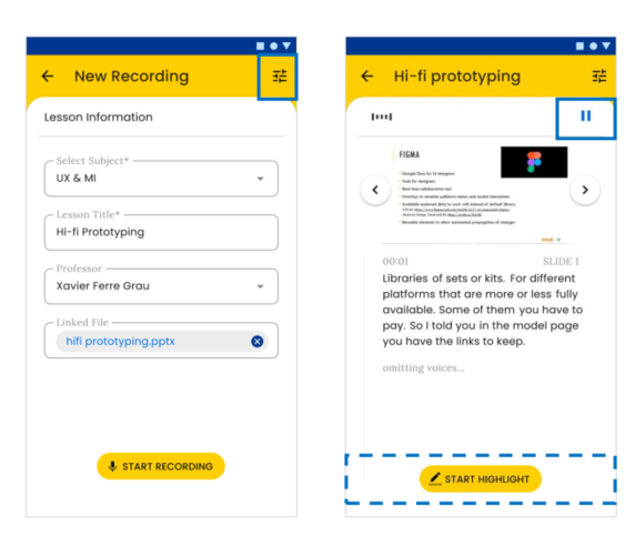
The test setup itself needed rebuilding to understand the efficiency result the UEQ surfaced — an unusual first item, and the right one, because a bad measurement is worth fixing before the thing it measures. The "file linking" and "page linking" concept needed its user flow and interaction reworked. Pause and stop buttons were not visible enough. Settings were hard to find, and the settings flow probably needed revising outright. And optional steps were not clearly enough distinguished from compulsory ones — the failure most likely to produce exactly the anxiety the product exists to remove.
What it taught me
Emotional design and colour psychology move engagement measurably in educational contexts — the 80% and the 70% are the evidence, whatever their sample. Automating a repetitive process removes cognitive load in a way that speeding it up does not, and the user spends the difference on the thing they came for. And context is the whole job: "students, during a lecture, unable to keep up" is a specific enough situation to design against, where "note-taking" is not.
Students were not asking for faster notes. They were asking to stop being afraid of missing something.
figma · emotional design · focus groups · journey mapping · mood boarding · design system · ueq · 3-person team